
Designing Rhythm Rang's Music Experience
The UI/UX process behind a full-stack music streaming platform, from layout decisions to building an AI chatbot with PyTorch.
Where It Started
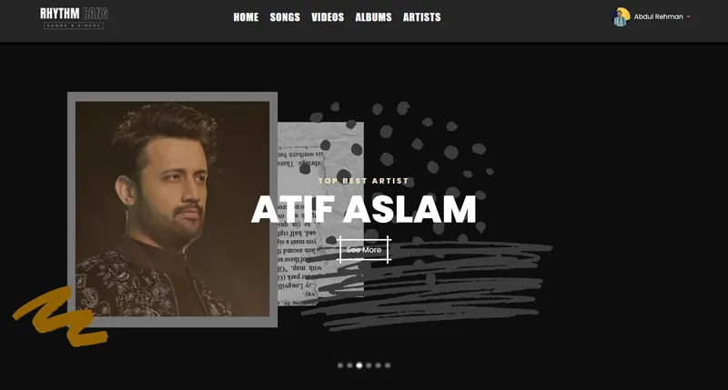
Rhythm Rang began as a question I kept asking myself: what would a music streaming platform look like if I built it from scratch? Not a Spotify clone, not a SoundCloud knockoff. Something with its own logic, its own way of handling discovery. I wanted to build a web application that handled both audio and video streaming, let users build playlists and wishlists, and included an AI chatbot that could actually help people find music. The whole thing ran on PHP and MySQL on the backend, with a separate Python service for the chatbot.
I started in early 2026. The first few weeks were just research. I studied how Spotify structures its browse pages, how YouTube Music handles the shift between audio and video, how Apple Music organizes artist profiles. I was not trying to copy any of them. I was trying to understand the patterns users already expect from a music platform UX, so I could make decisions about where to follow convention and where to break from it.
The Layout Problem
Music streaming UI design has a specific tension that most other web apps do not. The player controls need to be persistent. They sit at the bottom of the screen and stay there while the user browses. That means every page, every view, every modal has to account for the height the player takes up. It sounds simple, but it affects scroll behavior, content padding, and how you handle full-screen video playback.
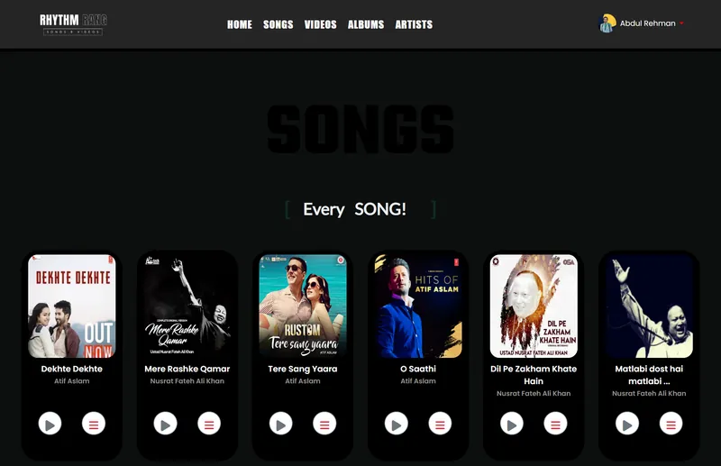
I used a fixed-bottom player bar with a 72px height. The main content area has bottom padding to match. When a user switches to video mode, the player expands into a larger viewport section. I considered a floating player approach (like the mini-player on YouTube) but decided against it. A floating element that follows you around the page creates visual clutter on a platform where users are already processing album art, song lists, and navigation menus. The fixed bar is predictable. Users know where it is without looking.
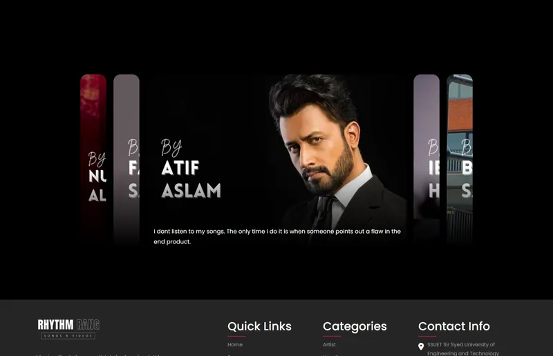
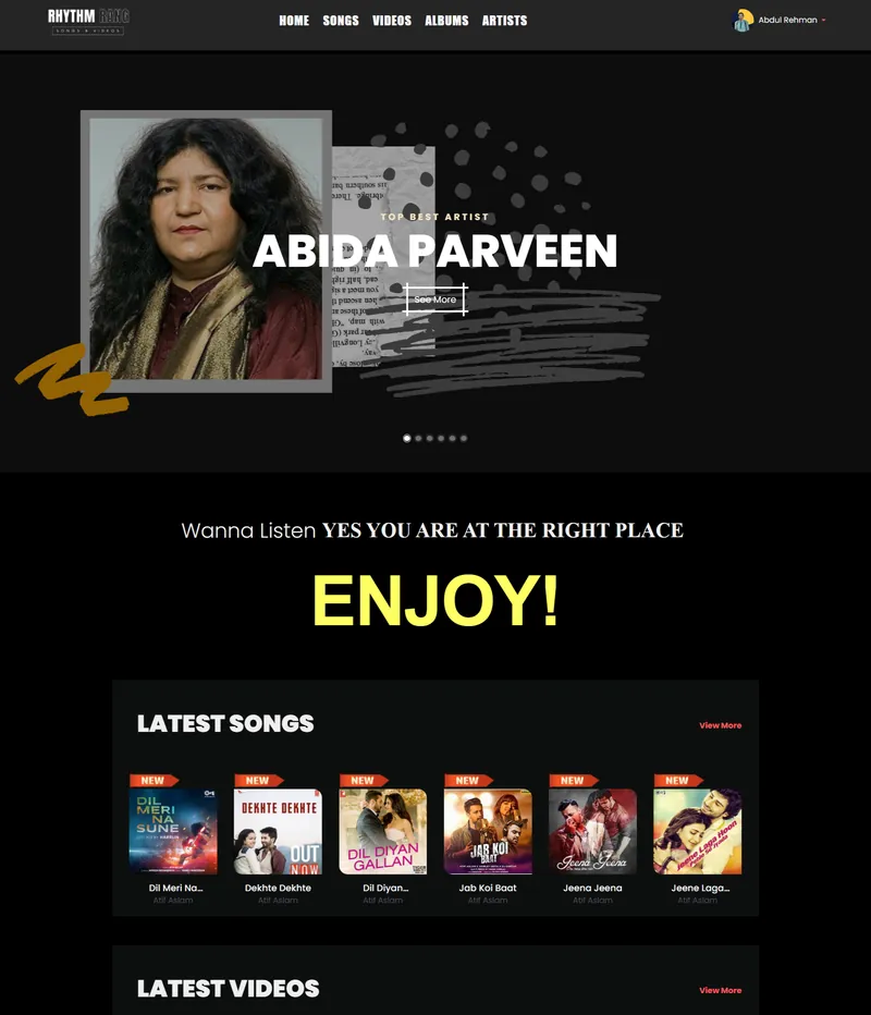
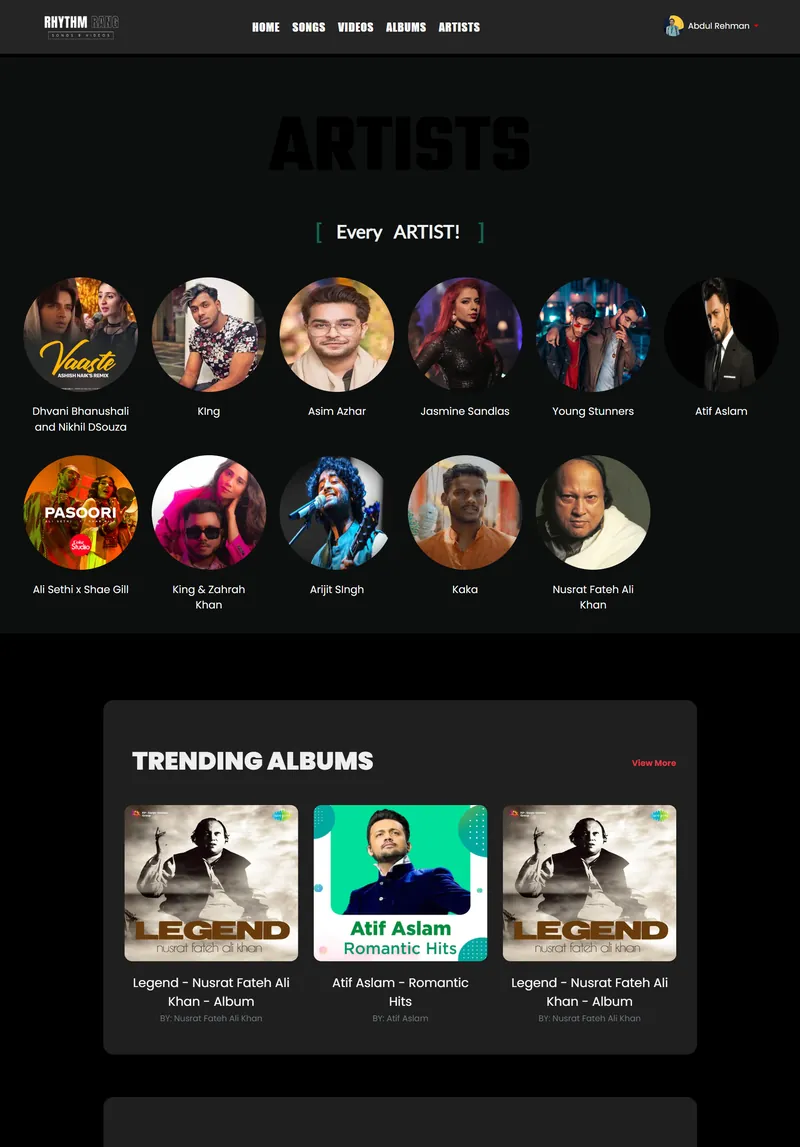
For the browse and discovery pages, I went with horizontal scroll rows grouped by category. Each row contains album or playlist cards. The card design uses a 1:1 aspect ratio for albums and a 16:9 ratio for video thumbnails. I kept the card information minimal: title, artist name, and a play icon on hover. No star ratings, no play counts on the card itself. That data exists in the backend, but putting it on every card adds noise without adding value for most users.
Building the AI Chatbot with PyTorch
The chatbot was the most technically demanding part of the project. I built it with Python, Flask, PyTorch, and NLTK. The model is intent-based, meaning it classifies user messages into predefined categories (like "find a song," "recommend an artist," or "help with navigation") and generates responses based on the matched intent.
The training data is stored in a JSON file with patterns and responses for each intent. NLTK handles tokenization and stemming. The bag-of-words representation gets fed into a small feedforward neural network built in PyTorch, with two hidden layers. I trained it on roughly 200 patterns across 15 intents. That is not a large dataset by any measure, but for a scoped chatbot that handles music queries and site navigation, it works well enough. The model runs as a Flask API, and the PHP frontend calls it through REST endpoints using AJAX.
One design decision I am glad I made early: keeping the chatbot service completely separate from the main PHP application. They communicate only through HTTP. This meant I could develop, test, and deploy the chatbot independently. When the chatbot had bugs (and it had plenty during training), the main site kept running without issues. If I had embedded the Python logic directly into the PHP stack through some kind of process call, debugging would have been much harder.
How Music Discovery Works
Discovery on Rhythm Rang works through three paths. The first is category browsing, where songs, albums, and videos are organized by genre and mood. The second is the search system, which queries the MySQL database across song titles, artist names, and album names using LIKE queries with proper indexing. The third path is the AI chatbot, which can suggest content based on conversational input.
I spent time thinking about how these three paths should feel different from each other. Category browsing is passive. The user scrolls through curated rows and picks something that catches their eye. Search is active and targeted. The chatbot sits somewhere in between. A user might type "something upbeat for working out" and the chatbot maps that to the right genre tags. It is a looser, more exploratory interaction than search, but more directed than browsing.
The chatbot widget sits in the bottom-right corner of the screen, opposite from the player controls. I intentionally placed them on different sides. Two persistent UI elements competing for the same screen edge would create a cramped feeling, especially on tablet-sized screens.
The Admin Dashboard
A music platform is only as good as its content management. The admin dashboard handles CRUD operations for songs, videos, artists, albums, banners, and user accounts. I built it with Bootstrap for speed, since the admin panel did not need the same level of visual polish as the public-facing site. The priority was functionality and clarity.
File uploads were one of the trickier parts. Audio files can be large, and the upload interface needs to give feedback about progress. I used AJAX-based uploads with a progress bar so admins can see exactly where the upload stands. For images (album art, artist photos, banner images), I enforced specific dimension requirements at the upload step. This prevents the common problem of admin-uploaded images breaking the frontend layout because they are the wrong aspect ratio.
Design Decisions I Would Revisit
There are a few things I would do differently if I were starting over. The color palette ended up darker than I initially planned. I was going for a cinema-like atmosphere, which works for video-heavy pages, but some of the text-heavy sections (like artist bios) feel a bit hard to read at smaller font sizes. I would increase the contrast ratio on body text if I rebuilt the UI.
The chatbot's training data could be larger. With 200 patterns, it handles the common queries well, but edge cases trip it up. A user asking "play something like Atif Aslam but more chill" is a reasonable request, but the intent classifier does not have enough nuance to parse comparative queries like that. Adding more training examples or switching to a transformer-based model would help, but that is a significant scope increase for a project that was already covering a lot of ground.
I also wish I had implemented WebSocket connections for the chatbot instead of polling. The current setup uses standard AJAX requests, which means the user sends a message, waits for the response, and the page updates. WebSockets would make the conversation feel more real-time and responsive. It is not a hard change technically, but I ran out of time during the initial build.
What I Took Away
Rhythm Rang taught me that web application design for media-heavy platforms is a different discipline than building a typical CRUD app or portfolio site. Every decision about layout, spacing, and component placement has to account for the fact that media is always playing. The user is always doing two things at once: listening (or watching) and browsing. The UI has to support both activities without making either one feel secondary.
Integrating the PyTorch chatbot through REST APIs was the right architectural call. Keeping services independent made the whole project more manageable. And the music platform UX research I did early on paid off throughout development. Knowing what patterns users expect from a music streaming UI design gave me a foundation to build on, even when I chose to deviate from those patterns.
If you want to see the project in detail, check out the Rhythm Rang case study or browse the source code on GitHub.