


My UI/UX Design Process from Research to Final Product
I have worked on enough design projects at this point to know that "process" is a generous word for what actually happens. Every project has its own rhythm. But there is a general shape to how I work, and writing it out felt overdue. This is how I approach UI/UX design, from the first conversation with a client to the moment code ships.
It starts with listening, not sketching
The temptation on any new project is to jump into Figma immediately. I used to do that. I would open a blank canvas and start placing rectangles before I understood what the product actually needed. The results were predictable: pretty screens that solved the wrong problems.
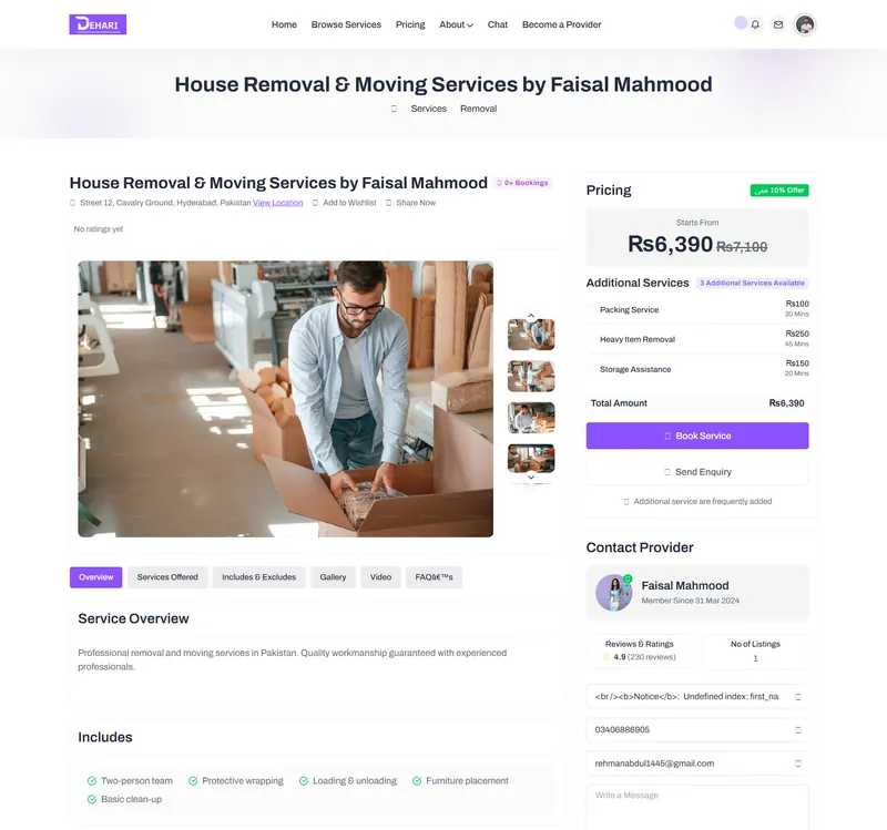
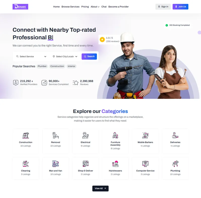
Now I spend the first few days on research. That means talking to the client, yes, but also talking to the people who will use the product. When I worked on Dehari (a home services platform here in Karachi), the initial brief was straightforward: let people book cleaning and maintenance services online. But after speaking with potential users, I found that trust was the real barrier. People wanted to see the service provider's photo and rating before booking. They wanted to know someone else in their neighborhood had used the person. That insight changed the entire information architecture.
I also study competitors during this phase. Not to copy them, but to understand what conventions users already expect. If every food delivery app puts the cart icon in the top right, putting it somewhere else is not creative. It is confusing.
Wireframing: ugly on purpose
My wireframes look rough. That is intentional. I use low-fidelity wireframes in Figma with gray boxes and placeholder text because the goal at this stage is structure, not style. When wireframes look too polished, clients fixate on colors and fonts instead of thinking about whether the user flow actually makes sense.
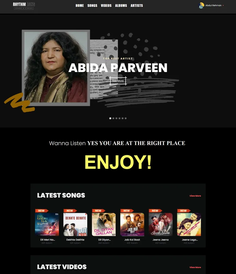
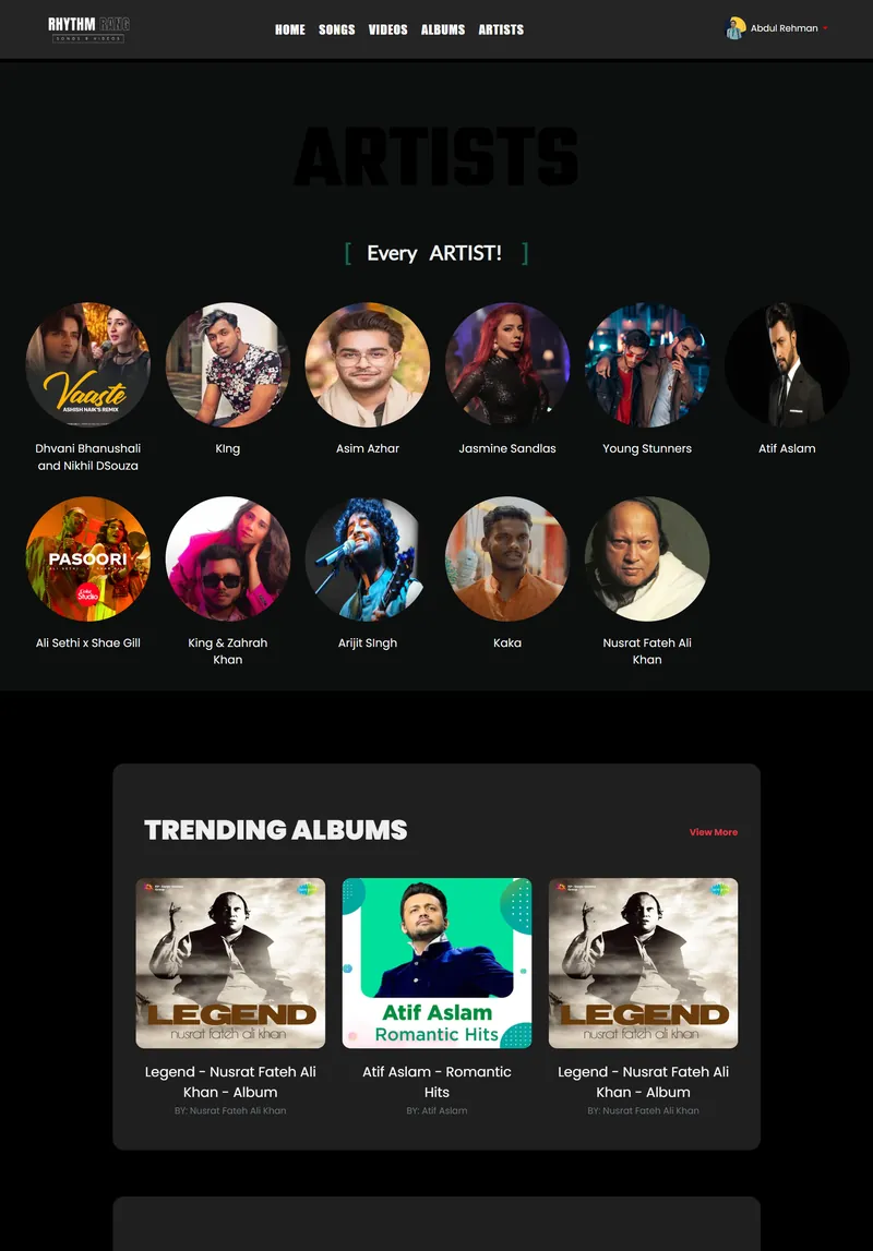
I typically build wireframes for the three or four most critical user journeys first. For Rhythm Rang (a music streaming platform I designed), those journeys were: discovering new music, creating a playlist, and finding a specific song. Everything else in the app had to support those three paths without cluttering them.
I organize my Figma files with a specific naming convention. Pages are numbered (01-Research, 02-Wireframes, 03-Visual Design, 04-Prototypes, 05-Handoff). Components live in a shared library. Auto layout is non-negotiable. I wasted too many hours in the past manually repositioning elements when content changed. Auto layout forces me to build frames that actually respond to real content, which saves time later when developers implement the design.
One thing I have learned the hard way: wireframe every screen, including error states and empty states. The "no results found" page and the loading skeleton matter just as much as the homepage hero. I missed these on an early project and the developer had to improvise. The result looked nothing like the rest of the app.
Visual design with constraints
Once the wireframes are approved, I move to high-fidelity visual design. This is where the project starts to look like something real. I pick a type scale first (usually based on a 1.25 ratio), establish a color palette, and define spacing using an 8px grid. These constraints speed things up. When I know the heading is always 32px and the body is always 16px, I do not waste time debating font sizes on every screen.
I build a component library before touching any actual screens. Buttons, input fields, cards, navigation bars, modals, toasts. All of these get designed as reusable Figma components with variants for different states (default, hover, active, disabled, error). This takes a full day or two, but it cuts the visual design phase in half because I am assembling screens from existing pieces rather than designing every element from scratch.
Color is where I see designers overthink things most often. I keep palettes small. A primary color, a secondary color, a neutral scale, and semantic colors for success, warning, and error. That is it. The Dehari project used a warm orange as its primary color because the brand needed to feel approachable and energetic. I tested that orange against WCAG contrast ratios to make sure it was accessible on both light and dark backgrounds.
Prototyping: click through it, break it
I prototype directly in Figma using Smart Animate and interactive components. The prototype needs to feel close enough to the real product that someone unfamiliar with the project can pick it up and complete a task without instruction. If they cannot, the design has a problem.
For Dehari, I built a prototype that covered the full booking flow: selecting a service category, choosing a provider, picking a date, confirming the booking, and viewing the confirmation screen. I shared this prototype link with five people who matched the target audience. Three of them got stuck on the same step, which was selecting a time slot. The calendar component I had designed looked clean but it was not obvious that you needed to tap a specific time, not just a date. I redesigned that component and tested again. The second round went smoothly.
I do not run formal usability studies with eye tracking software and think-aloud protocols. My testing is practical: I hand someone a phone with the prototype loaded, give them a task ("book a plumber for next Tuesday"), and watch what happens. Where do they hesitate? Where do they tap the wrong thing? Where do they look confused? Those moments are where the design needs work.
Handoff: the part most designers underestimate
A beautiful Figma file is worthless if the developer cannot translate it into code accurately. I have been on both sides of this. As someone who also writes frontend code (HTML, CSS, JavaScript, React), I know what information developers actually need and what they ignore.
My handoff process includes a few specific things. First, I use Figma's Dev Mode and ensure every frame has proper auto layout, correct spacing values, and named layers. Second, I write a brief spec document that covers interaction details Figma cannot show: animation timing, scroll behavior, what happens when text overflows, how the layout adapts between breakpoints. Third, I create a component map that shows developers which Figma component corresponds to which code component.
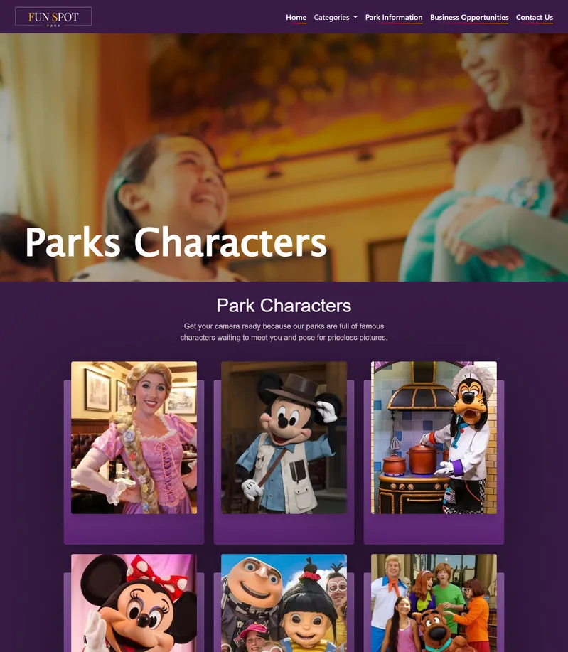
I also annotate edge cases directly in the Figma file. What happens when a user's name is 40 characters long? What does the card look like with no image? What if the API returns an error during checkout? Developers should not have to guess about these scenarios. When I worked on Fun Spot Park's website, I documented every responsive breakpoint with specific notes about what changed at each width. The developer told me it was the easiest handoff he had worked with. That feedback stuck with me.
What I have changed my mind about
A few years ago, I thought pixel-perfect design was the goal. Every element exactly where I placed it, every margin exact to the pixel. I do not believe that anymore. The web is fluid. Content changes. Screens come in sizes I cannot predict. I now design systems rather than screens. If the system is solid (consistent spacing, flexible components, clear hierarchy), the individual screens take care of themselves.
I also used to skip user research on smaller projects, telling myself there was not enough budget or time. That was a mistake. Even 30 minutes of talking to two or three potential users reveals assumptions I did not know I was making. On a recent project for a local restaurant, I assumed customers would want to filter the menu by cuisine type. Turns out they just wanted to see what was popular and what was new. That conversation saved me from building a filtering system nobody would have used.
Another shift: I stopped treating design and development as separate phases. On my recent projects, I start coding the component library in HTML and CSS while still refining the visual design in Figma. This parallel workflow surfaces problems earlier. A layout that looks perfect in Figma sometimes falls apart when real browser rendering is involved, especially with dynamic text content or unusual viewport sizes.
The short version
My UI/UX design process is: research first, wireframe ugly, build a component system, prototype and test with real people, hand off with thorough documentation, and stay involved during development. Every step feeds the next. Skipping one makes the others harder. The process is not glamorous but it produces work I am proud of, and more importantly, products that people can actually use without frustration.
If you are working on a product and want to talk about how design can improve it, get in touch. I am always interested in projects where good design can make a measurable difference.